
We’re pleased to introduce Cloudflare’s new and improved Network Analytics dashboard. It’s now available to Magic Transit and Spectrum customers on the Enterprise plan.
The dashboard provides network operators better visibility into traffic behavior, firewall events, and DDoS attacks as observed across Cloudflare’s global network. Some of the dashboard’s data points include:
- Top traffic and attack attributes
- Visibility into DDoS mitigations and Magic Firewall events
- Detailed packet samples including full packets headers and metadata
This dashboard was the outcome of a full refactoring of our network-layer data logging pipeline. The new data pipeline is decentralized and much more flexible than the previous one — making it more resilient, performant, and scalable for when we add new mitigation systems, introduce new sampling points, and roll out new services. A technical deep-dive blog is coming soon, so stay tuned.
In this blog post, we will demonstrate how the dashboard helps network operators:
- Understand their network better
- Respond to DDoS attacks faster
- Easily generate security reports for peers and managers
Understand your network better
One of the main responsibilities network operators bare is ensuring the operational stability and reliability of their network. Cloudflare’s Network Analytics dashboard shows network operators where their traffic is coming from, where it’s heading, and what type of traffic is being delivered or mitigated. These insights, along with user-friendly drill-down capabilities, help network operators identify changes in traffic, surface abnormal behavior, and can help alert on critical events that require their attention — to help them ensure their network’s stability and reliability.
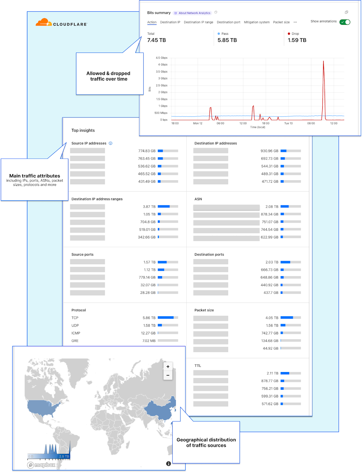
Starting at the top, the Network Analytics dashboard shows network operators their traffic rates over time along with the total throughput. The entire dashboard is filterable, you can drill down using select-to-zoom, change the time-range, and toggle between a packet or bit/byte view. This can help gain a quick understanding of traffic behavior and identify sudden dips or surges in traffic.
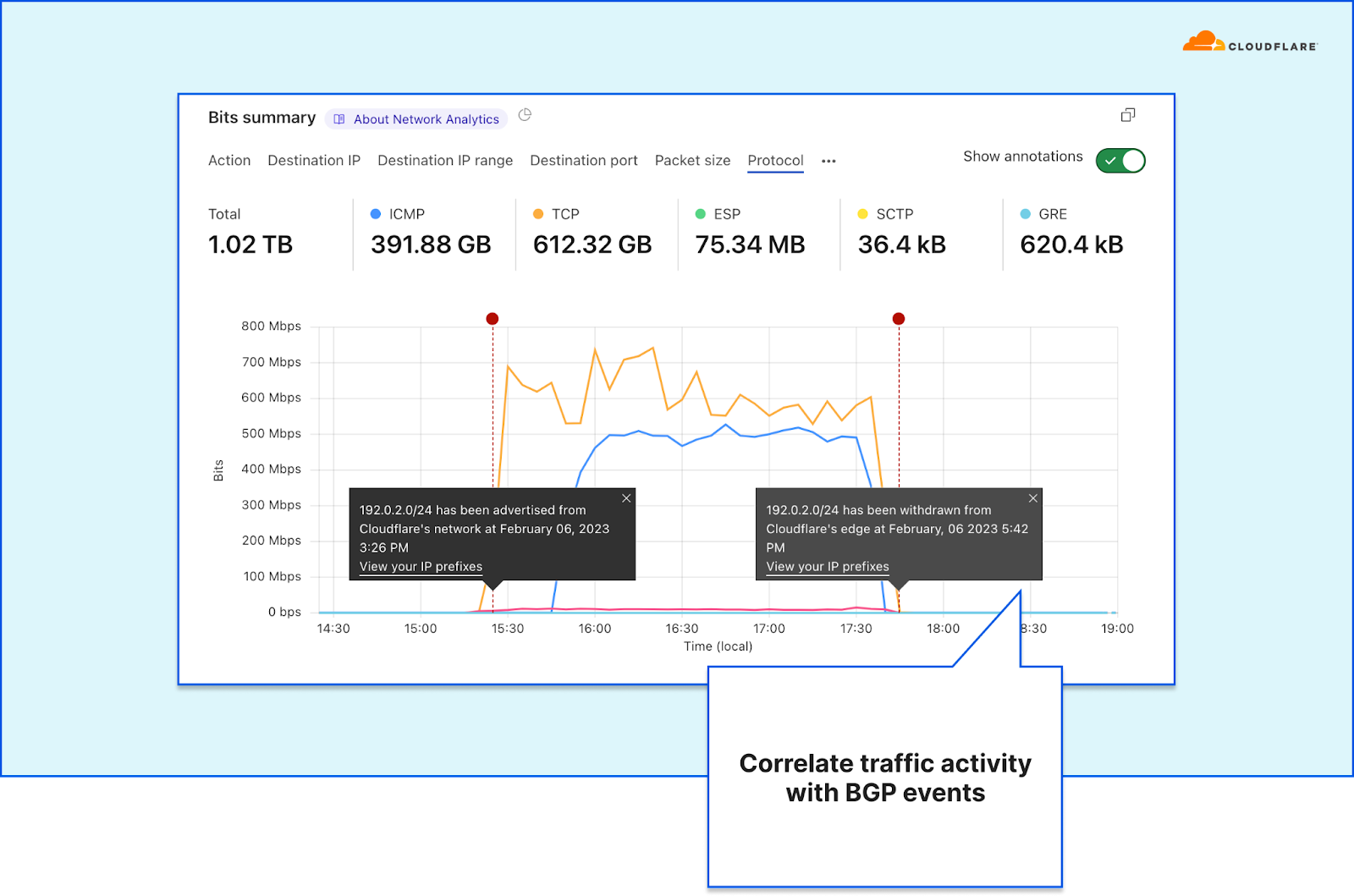
Cloudflare customers advertising their own IP prefixes from the Cloudflare network can also see annotations for BGP advertisement and withdrawal events. This provides additional context atop of the traffic rates and behavior.
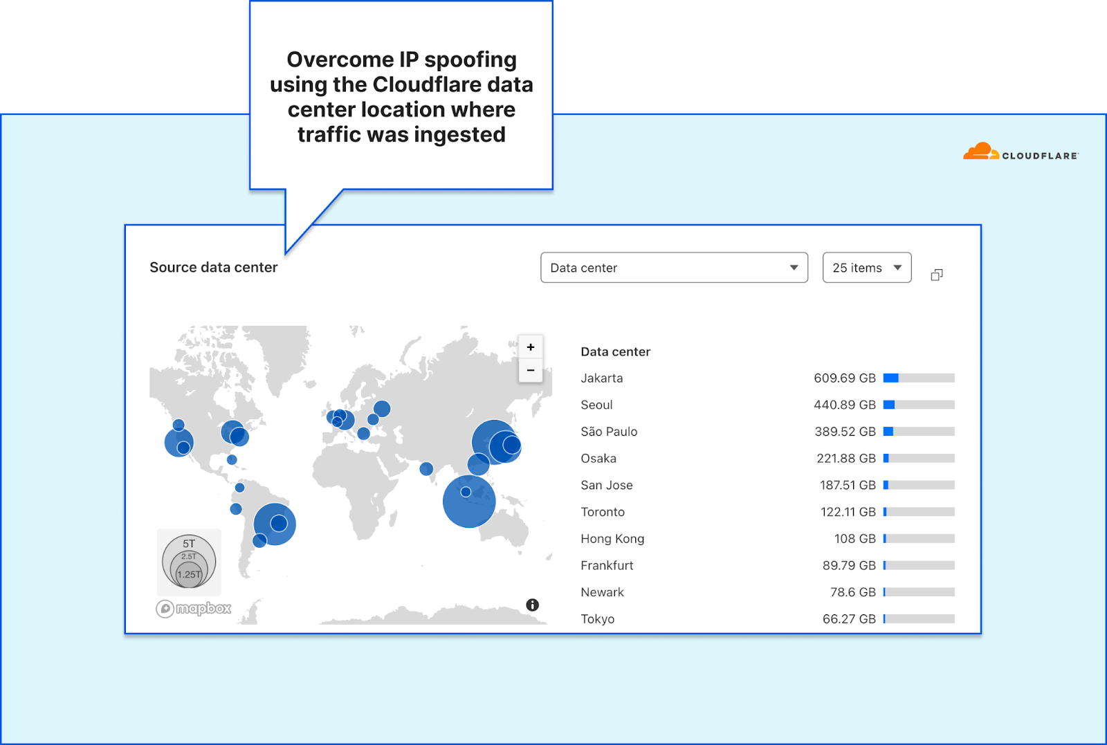
Geographical accuracy
One of the many benefits of Cloudflare’s Network Analytics dashboard is its geographical accuracy. Identification of the traffic source usually involves correlating the source IP addresses to a city and country. However, network-layer traffic is subject to IP spoofing. Malicious actors can spoof (alter) their source IP address to obfuscate their origin (or their botnet’s nodes) while attacking your network. Correlating the location (e.g., the source country) based on spoofed IPs would therefore result in spoofed countries. Using spoofed countries would skew the global picture network operators rely on.
To overcome this challenge and provide our users accurate geoinformation, we rely on the location of the Cloudflare data center wherein the traffic was ingested. We’re able to achieve geographical accuracy with high granularity, because we operate data centers in over 285 locations around the world. We use BGP Anycast which ensures traffic is routed to the nearest data center within BGP catchment.
Detailed mitigation analytics
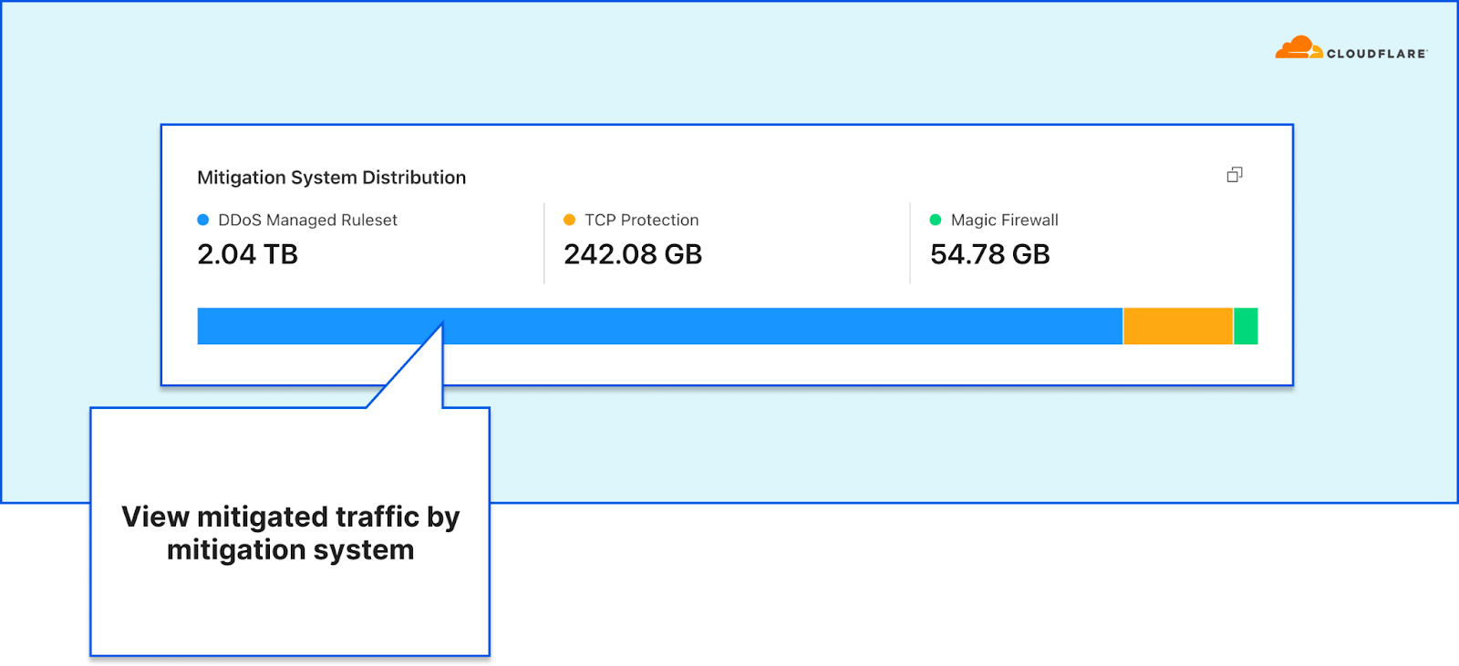
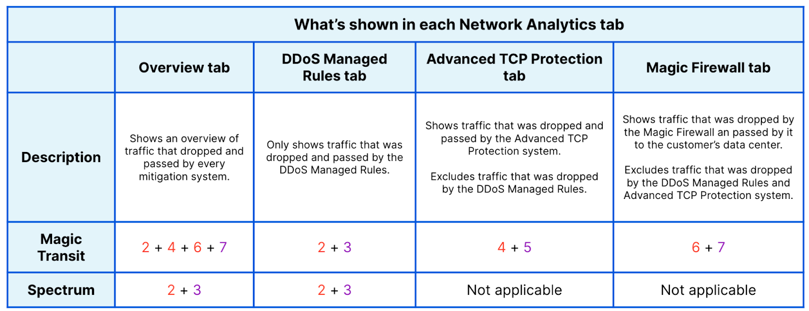
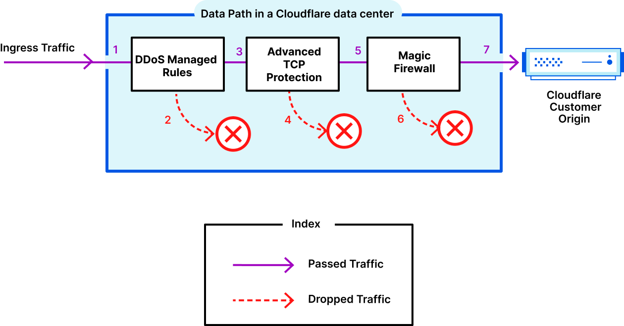
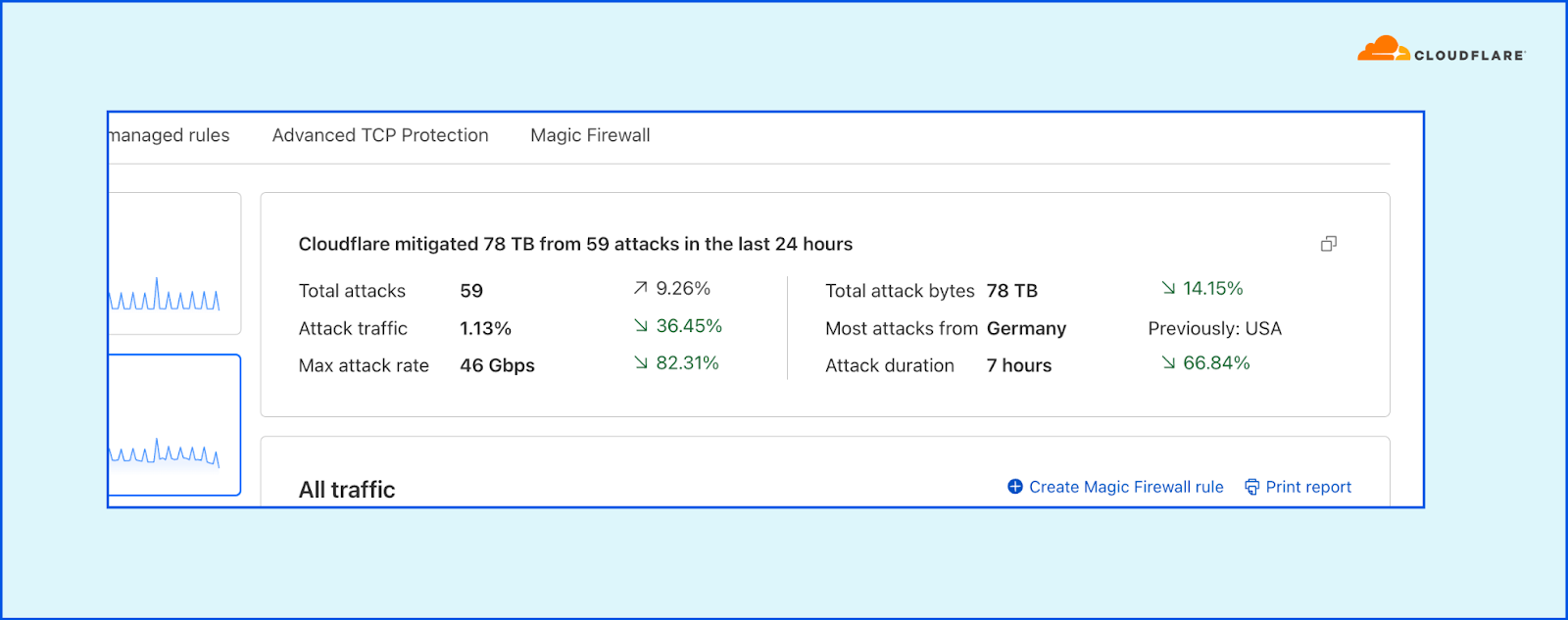
The dashboard lets network operators understand exactly what is happening to their traffic while it’s traversing the Cloudflare network. The All traffic tab provides a summary of attack traffic that was dropped by the three mitigation systems, and the clean traffic that was passed to the origin.
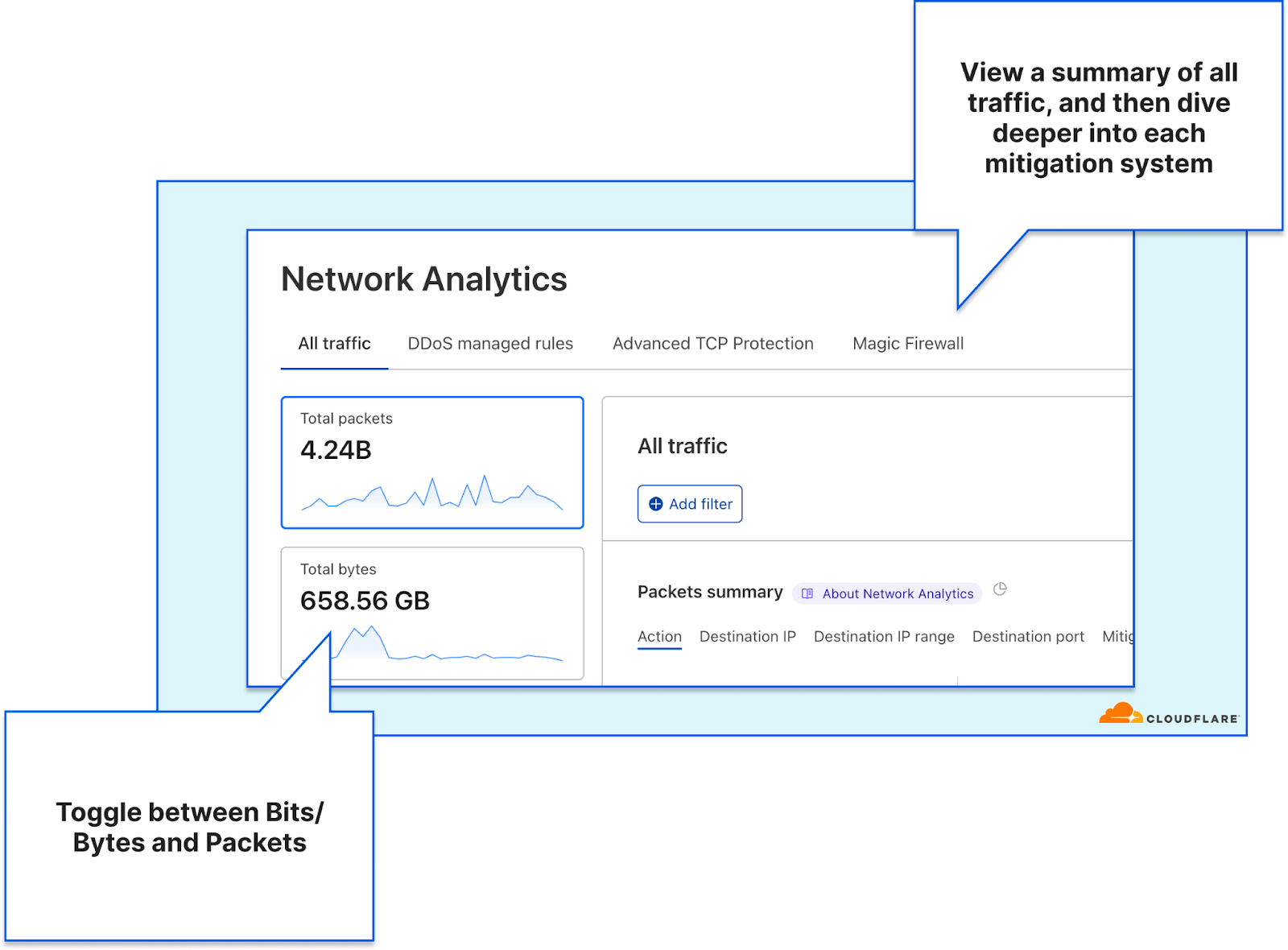
Each additional tab focuses on one mitigation system, showing traffic dropped by the corresponding mitigation system and traffic that was passed through it. This provides network operators almost the same level of visibility as our internal support teams have. It allows them to understand exactly what Cloudflare systems are doing to their traffic and where in the Cloudflare stack an action is being taken.
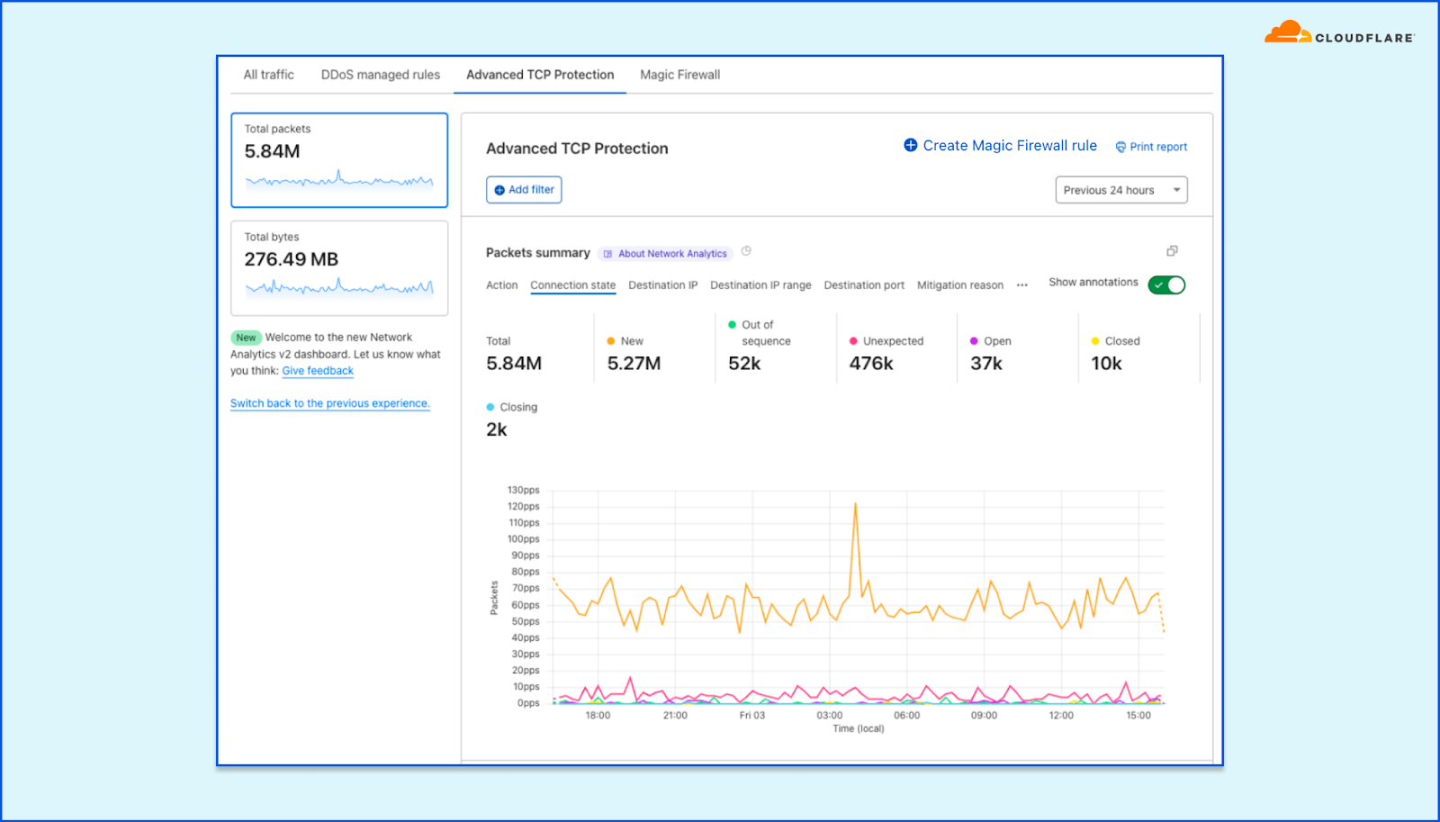
Using the detailed tabs, users can better understand the systems’ decisions and which rules are being applied to mitigate attacks. For example, in the Advanced TCP Protection tab, you can view how the system is classifying TCP connection states. In the screenshot below, you can see the distribution of packets according to connection state. For example, a sudden spike in Out of sequence packets may result in the system dropping them.
Note that the presence of tabs differ slightly for Spectrum customers because they do not have access to the Advanced TCP Protection and Magic Firewall tabs. Spectrum customers only have access to the first two tabs.
Respond to DDoS attacks faster
Cloudflare detects and mitigates the majority of DDoS attacks automatically. However, when a network operator responds to a sudden increase in traffic or a CPU spike in their data centers, they need to understand the nature of the traffic. Is this a legitimate surge due to a new game release for example, or an unmitigated DDoS attack? In either case, they need to act quickly to ensure there are no disruptions to critical services.
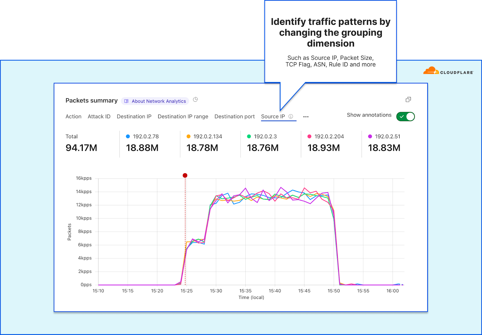
The Network Analytics dashboard can help network operators quickly pattern traffic by switching the time-series’ grouping dimensions. They can then use that pattern to drop packets using the Magic Firewall. The default dimension is the outcome indicating whether traffic was dropped or passed. But by changing the time series dimension to another field such as the TCP flag, Packet size, or Destination port a pattern can emerge.
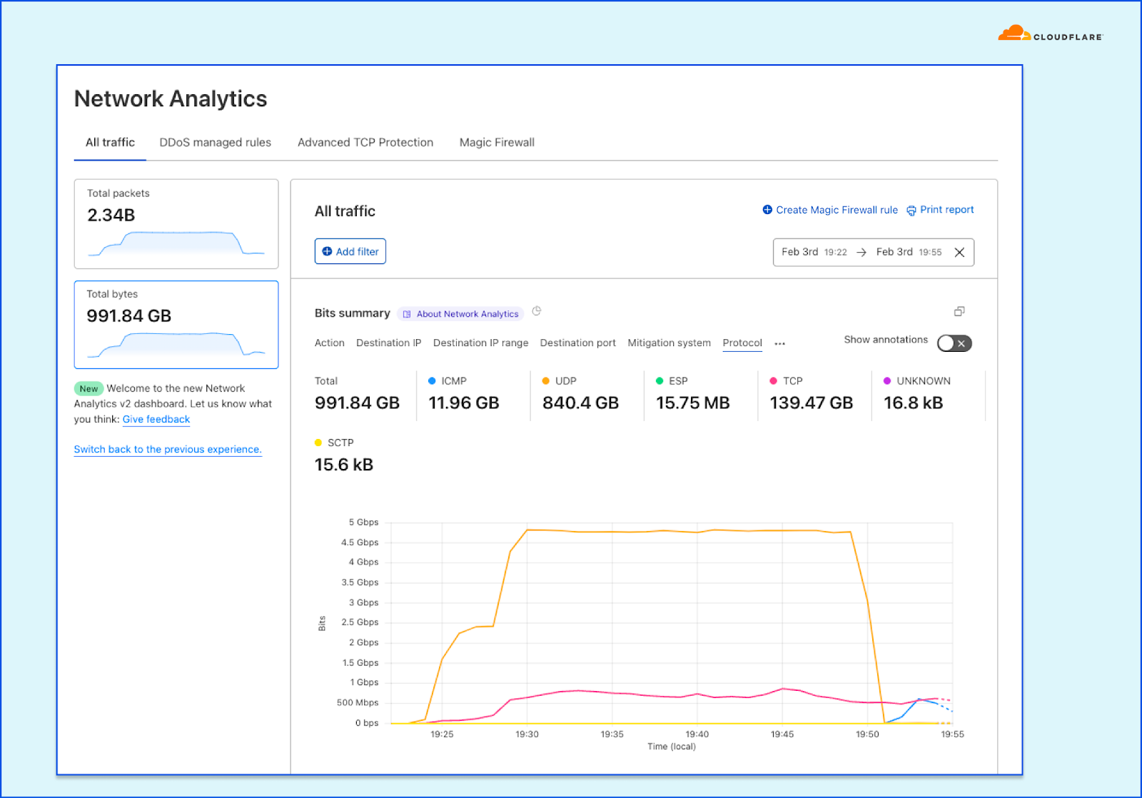
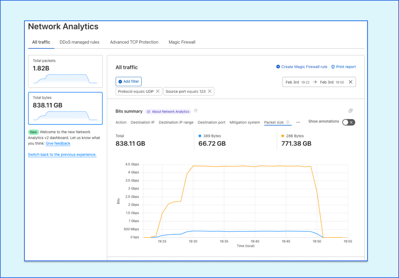
In the example below, we have zoomed in on a surge of traffic. By setting the Protocol field as the grouping dimension, we can see that there is a 5 Gbps surge of UDP packets (totalling at 840 GB throughput out of 991 GB in this time period). This is clearly not the traffic we want, so we can hover and click the UDP indicator to filter by it.
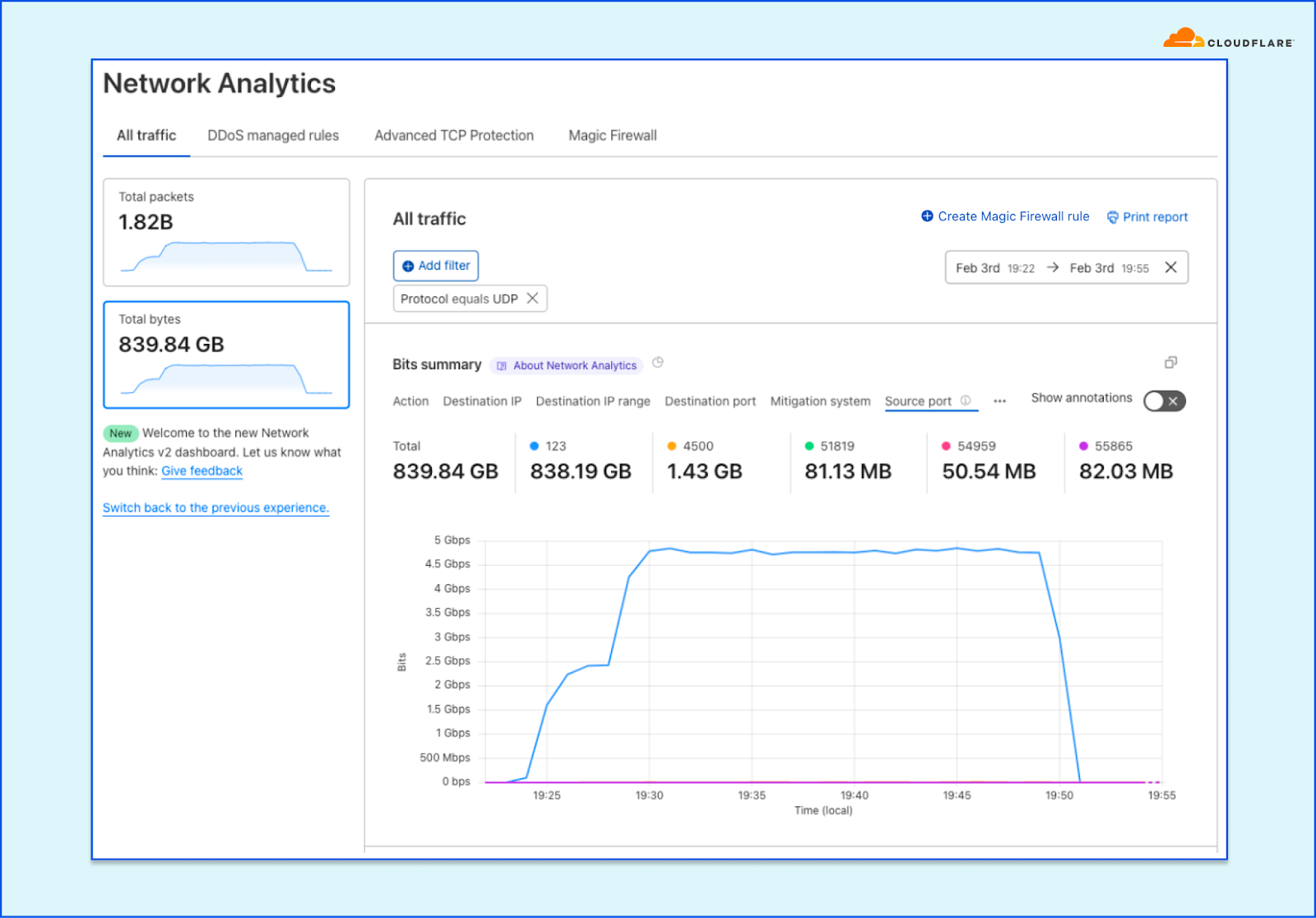
We can then continue to pattern the traffic, and so we set the Source port to be the grouping dimension. We can immediately see that, in this case, the majority of traffic (838 GB) is coming from source port 123. That’s no bueno, so let’s filter by that too.
We can continue iterating to identify the main pattern of the surge. An example of a field that is not necessarily helpful in this case is the Destination port. The time series is only showing us the top five ports but we can already see that it is quite distributed.
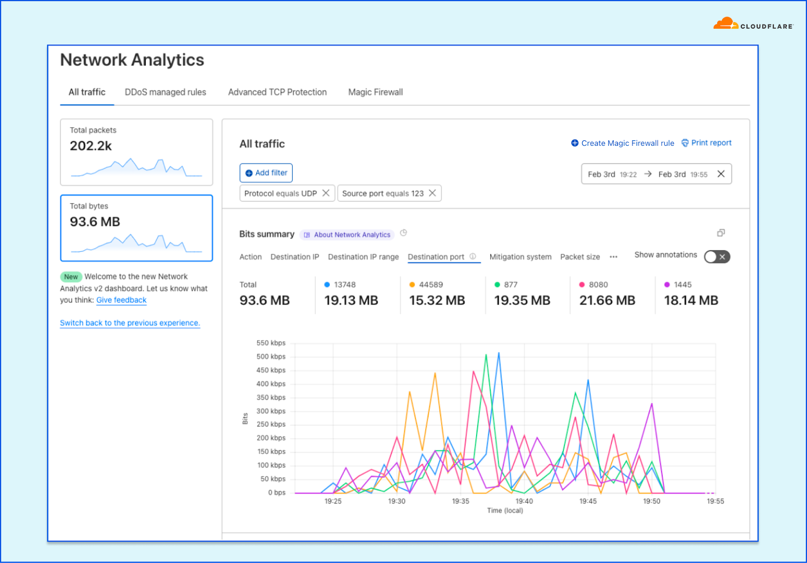
We move on to see what other fields can contribute to our investigation. Using the Packet size dimension yields good results. Over 771 GB of the traffic are delivered over 286 byte packets.
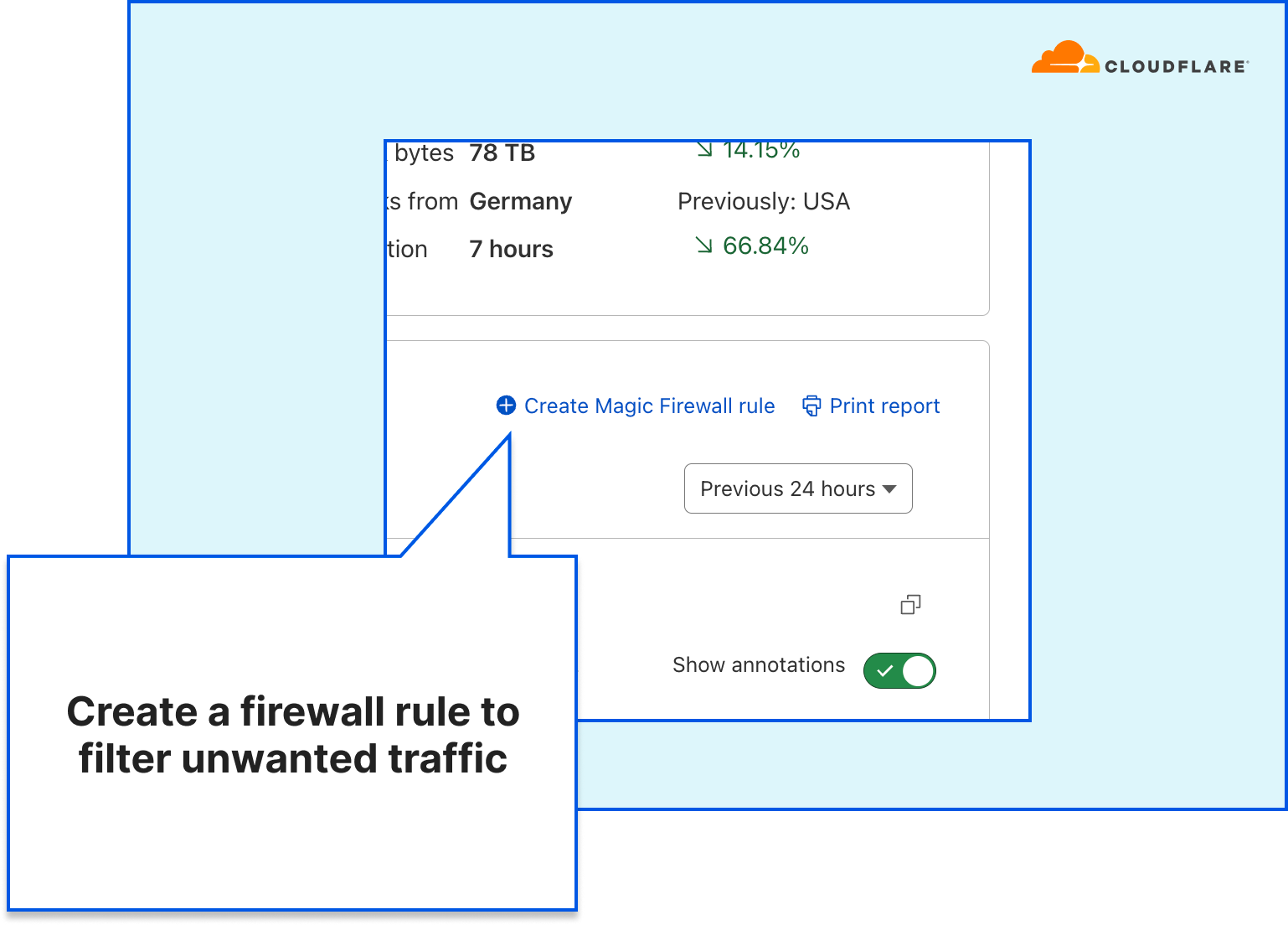
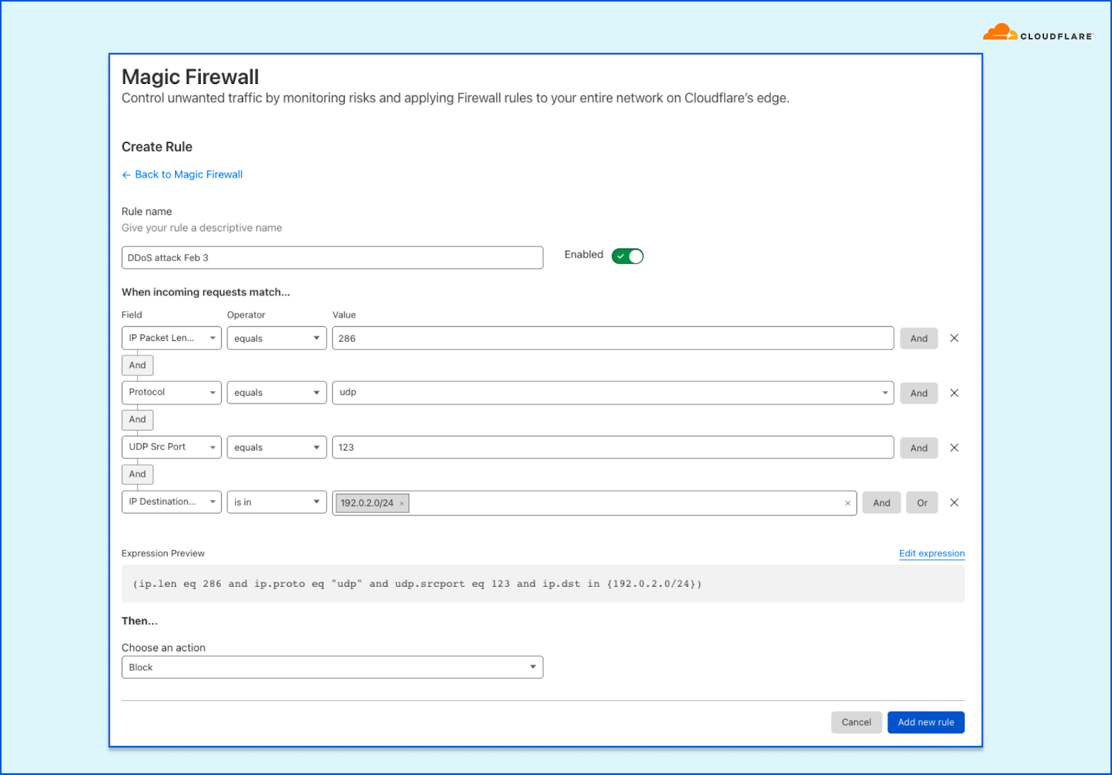
Assuming that our attack is now sufficiently patterned, we can create a Magic Firewall rule to block the attack by combining those fields. You can combine additional fields to ensure you do not impact your legitimate traffic. For example, if the attack is only targeting a single prefix (e.g., 192.0.2.0/24), you can limit the scope of the rule to that prefix.
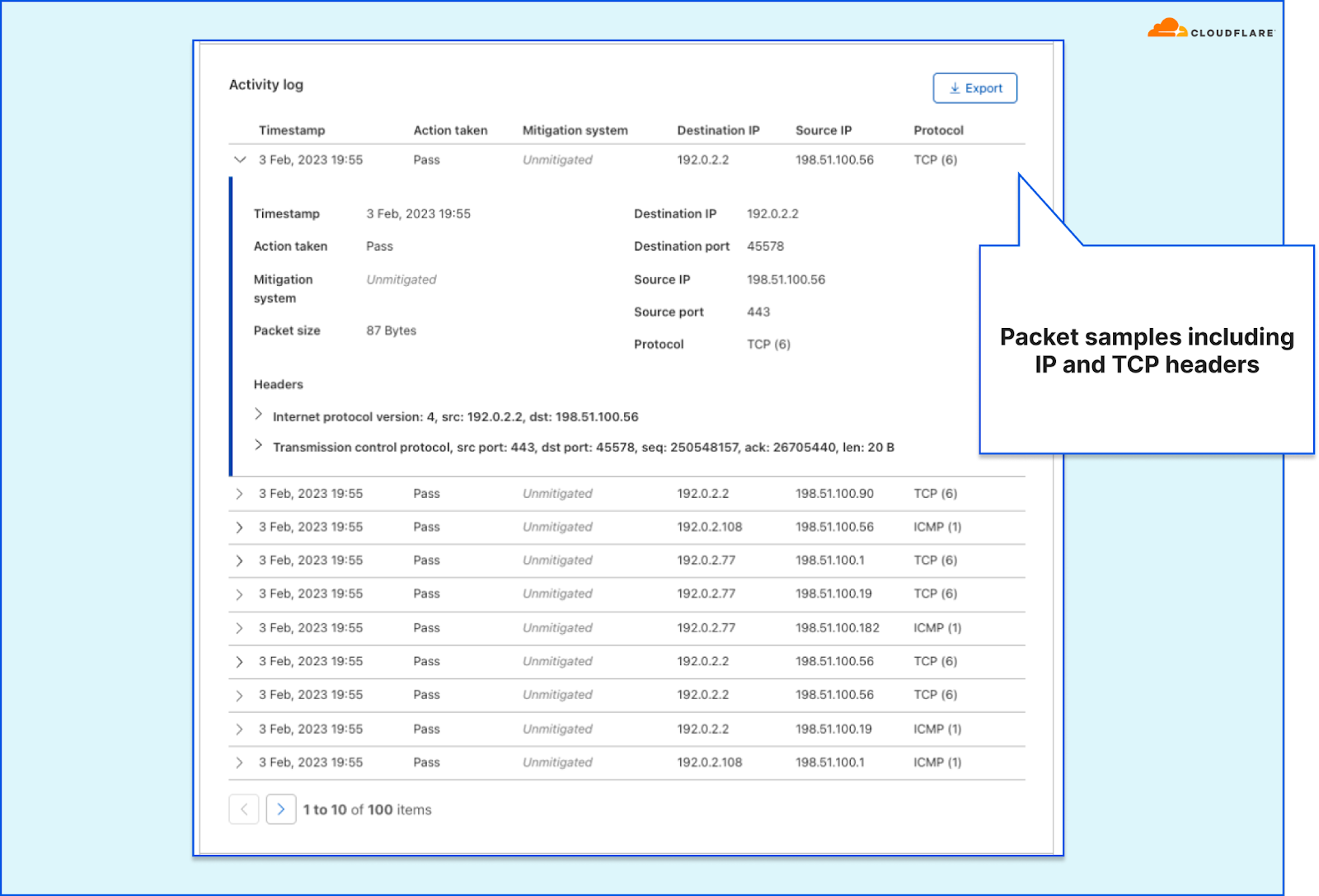
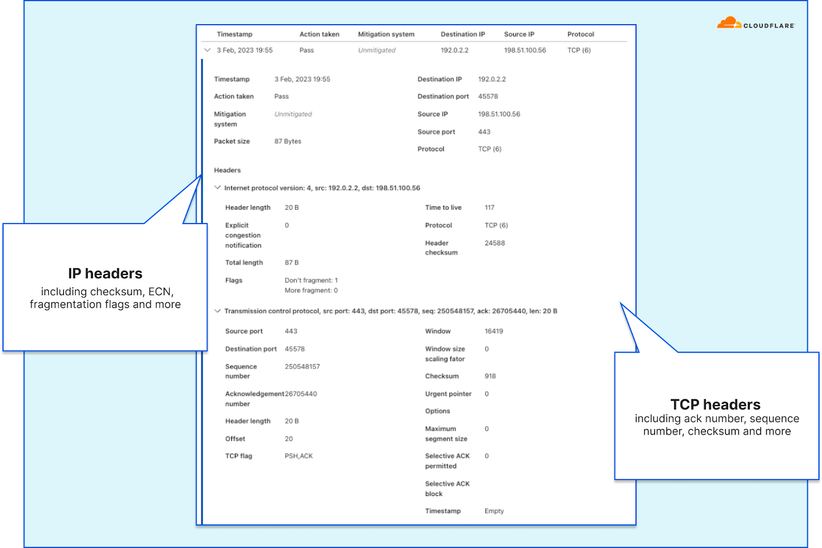
If needed for attack mitigation or network troubleshooting, you can also view and export packet samples along with the packet headers. This can help you identify the pattern and sources of the traffic.
Generate reports
Another important role of the network security team is to provide decision makers an accurate view of their threat landscape and network security posture. Understanding those will enable teams and decision makers to prepare and ensure their organization is protected and critical services are kept available and performant. This is where, again, the Network Analytics dashboard comes in to help. Network operators can use the dashboard to understand their threat landscape — which endpoints are being targeted, by which types of attacks, where are they coming from, and how does that compare to the previous period.
Using the Network Analytics dashboard, users can create a custom report — filtered and tuned to provide their decision makers a clear view of the attack landscape that’s relevant to them.
In addition, Magic Transit and Spectrum users also receive an automated weekly Network DDoS Report which includes key insights and trends.
Extending visibility from Cloudflare’s vantage point
As we’ve seen in many cases, being unprepared can cost organizations substantial revenue loss, it can negatively impact their reputation, reduce users’ trust as well as burn out teams that need to constantly put out fires reactively. Furthermore, impact to organizations that operate in the healthcare industry, water, and electric and other critical infrastructure industries can cause very serious real-world problems, e.g., hospitals not being able to provide care for patients.
The Network Analytics dashboard aims to reduce the effort and time it takes network teams to investigate and resolve issues as well as to simplify and automate security reporting. The data is also available via GraphQL API and Logpush to allow teams to integrate the data into their internal systems and cross references with additional data points.
To learn more about the Network Analytics dashboard, refer to the developer documentation.